Web design trends seems to be changing as fast as Google ranking factors! Small businesses can find it challenging to keep their website fresh and functional. By functional I mean having specific actions that the visitor should be guided to complete. If you’re in the process of putting together a new website, have been considering a change or have simply had the same website for years, this blog post might help you get a goal-oriented website by utilizing the following trends:
AMP (Accelerated Mobile Pages)
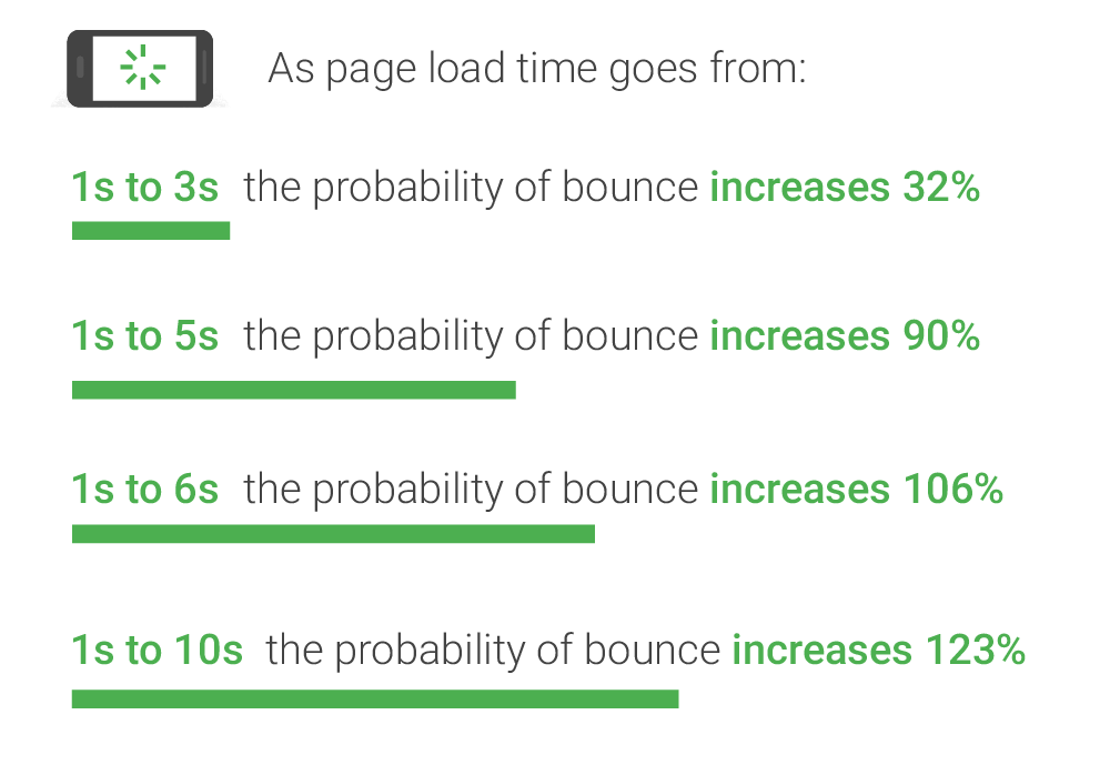
In case you didn’t know, the load time of your pages can significantly impact bounce rate (how quickly visitors leave your website). Most visitors don’t want to wait more than 3-4 seconds for a web page to load. Anything beyond that and you most likely will have the visitor leave (particularly on mobile devices). Check out the stat below from recent Google research:
You can see the sweet spot for reducing bounce rate (visitors leaving) is in the 1-3 second load time!
So how does AMP work?
Basically it is the modification of a page to load scripts (and other large files) after the initial page content. This allows the most important parts of the page (important to the visitor) to come in first while the other background files load in the background. As a matter of fact Google reports that AMP Pages served in Google Search typically load in less than one second and use 10 times less data than the equivalent non-AMP pages! If you’ve got a lot of fancy animations going on with your website or blog make sure to implement AMP and keep visitors on your website.
Website Personalization
This trend will be a bit tricker for small businesses to implement compared to others. It usually requires some sort of software or solution that will help scale the personalization based on user behaviour, demographics and context. In short: your website displays information based on the visitor information – it is able to distinguish from user to user based on their behaviour and then show appropriate content/offers/call to actions specific to that behaviour.
Scary? A little.
Useful? Absolutely.
You’ve probably come across this at some point while shopping online. If you’ve visited your favourite online retailer, decided not to buy anything and went back to Facebook to see what your friends are up to; you may have seen an ad from that web store offering you a coupon for free shipping. You click on it, get back to the webstore and voila – the coupon is already applied or coupon code is always visible. Personalization.
You send messages users want to see!
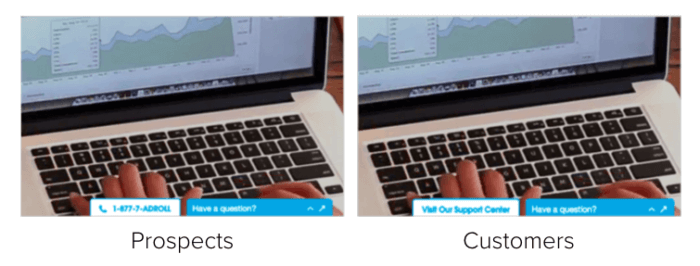
Another great, yet simple example is from Adroll (screenshot taken from Optimizely blog). Their live chat wording changes from customers (logged in – Support Centre link) and prospects (non-logged in visitors – 1-800 number):
Security
SSL (Secure Sockets Layer) in the past has been viewed as a security level for online transactions and ecommerce stores. Now it has a direct influence on SEO rankings. What is SSL? It is moving your website from a non-secure hosting (HTTP) to secure (HTTPS). When you see the green lock on a domain you’re visiting that is how you know the website is hosted securely:
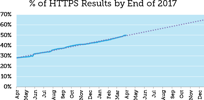
Not only does this provide a level of security for your visitors but it directly influences your web page’s ability to rank on the 1st page of Google for targeted terms. According to a recent Moz blog post, pages with HTTPS will account for 65% of 1st page Google results:
Whether your small business sells goods/services online, produces content or contains informational pages – it should be moved over to HTTPS.
Data Driven Changes
 This is somewhat relevant to the website personalization point. It basically means that your web pages and website structure are driven by analyzing visitor behaviour. A good example of this would be not having a mobile-friendly website. Using your free Google Analytics tracking you find out that majority of your mobile and tablet device visitors only view one page then leave. This could be an indication that you need to improve mobile usability and keep visitors happy on mobile devices.
While this is a fairly straight forward example there are plenty of other improvements and tweaks that can be made to improve a website based on available data. It can be as big as redesigning the entire menu structure to as small as the wording on a call to action button (wording, colour, etc). Take advantage of the data you have and constantly try to uncover ways in which to improve your visitor’s website journey.
Are you planning to implement any of these changes for your website? Coming across any obstacles?


